What kind of negative is easy to print in the darkroom? What kind of negative is hard?
This short text treats the subject from the point of view of fine art printing, meaning that the result we are after is a gelatin silver print with a rich tonal range. I base this text on my own experiences. I've noticed that for me the easiness or the challenge of the negative is based usually on four different variables. They are:
1. Light
2. Exposure
3. Subject matter
4. Other possible variables
Light
What kind of light there is in the picture and how the photograph is exposed are certainly tied together. I've put them in their own categories because both of those variables affects also individually to the fact how hard I feel it is to make a successful print out of a certain negative.
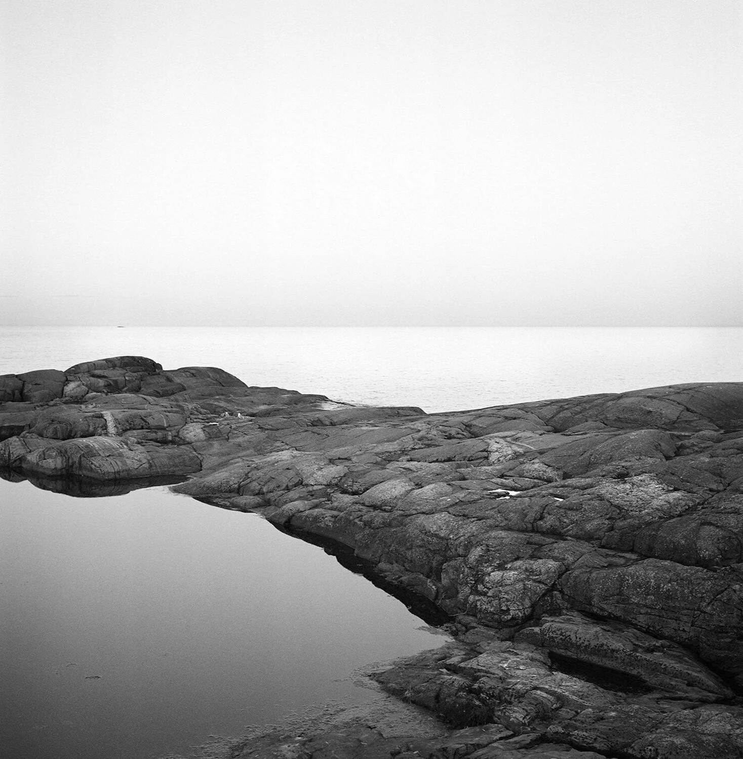
I took this photo at Haru, Trove Jansson's and Tuulikki Pietilä's summer cottage island, just before the dawn. The rich tonal range makes it rewarding to print in the darkroom. However the upper corners are a challenge. They should reach the same tone to balance the composition. The right corner is originally a bit lighter than the left, and getting these even is very hard as the tonal difference is small and the sky area is very light. Haru. Porvoon saaristo, Suomi. 2012.
In photography the meaning of light conditions is evident. Especially important it is with analogue techniques, with which you have much less possibilities than in Photoshop or similar computer software to alter the results afterwards.
The general rule is, that if you aim to the print which has a rich tonal range in grey, the most difficult negatives to print are those with very strong contrasts. If the lighting in the picture is extremely bright and contrasty, it's hard to get the subtle tones to the print in the darkroom as well. The hardest to reach the rich tones are in my opinion the images with bright midday sunlight or hard flash.
The ultraviolet radiation affects also to the result often so that even though the contrasts would be hard the overall feeling of the image is weirdly flattened. The effect depends on the camera quite a lot, but I recommend using an UV filter if there is one available for your camera model.
In colour photography there's sometimes mentioned the term Golden Hour, which usually means the moment when the sun is setting or rising and the light is soft and golden. These hours are valuable also for the black and white film photographers.
I've noticed that the light is the subtlest and most beautiful often just before the sunrise, just seconds before the light hits the subject I'm photographing. The light is then very gentle and the tones come out in the resulting print as rich and expressive. This applies to all the subjects, but for me it's often a landscape I'm after. That's why – when travelling somewhere – I usually scout the surroundings on the day before. I walk in the area and find the spots I definitely want to photograph at dawn. Then I choose a hostel nearby those spots and wake up before the dawn to capture especially those places and subjects.

The most beautiful Golden Hour I've ever encountered was in Varanasi, India in 2008. The morning mist and smoke hanging above the holy river Ganges reflected the light from the water right back in the air. Crow. Varanasi, India. 2008.
Exposure
How the negative has been exposed has definitely a lot to do with the challenge you’ll face in the darkroom. Many black and white films are ok with overexposure, most even two stops, but underexposure is often more difficult to handle for them. If you end up with an underexposed negative (you couldn't for example for some reason push the film in the developing process) it means usually that the negative is very thin. With a thin negative it's extremely challenging to get the tones out especially from the dark end. The same applies of course the overexposed negative and the light end.
With those subjects I photograph the most (views and landscapes) the hardest are by far the underexposed negatives. That's why I usually overexpose all my films, even risking the fact that the sky area might get too much light. I usually expose two stops over what my selenium light meter tells me to in my Rollei, as it's not a spot meter. If I use a spot meter I expose usually according to the land and never the sky, except in those cases the clouds are indeed the main subject matter of the picture.
(I'll write another text about the measures you can take in the darkroom if you've got underexposed negative in your hands, and you still want to make something out of it.)
The subject matter

If this landscape would have been photographed in a harsh light, it would be extremely challenging to print in the darkroom. Now, fortunately, the clouds behind the trees and the low, subtle light make it fairly easy. Afternoon Light. Suvanto, Finland. 2000.
If the negative is easy or hard to print in the darkroom depends also naturally on your subject matter. The subject matter and light conditions are often tied together. In a good light even the hardest subjects might come out all right, whereas in the hard light conditions they may be impossible to print. Typical example of a difficult subject matter is a picture where there is a snowy scene in the forest and the dark tree branches continue to the top of the image.

Monk at Ghoom monastery. Darjeeling, India, 2008.
In this kind of image it's very challenging to get the tones in both the trees but so that the sky between them doesn't stay all white and bleed to the paper base whiteness. If printing this kind of an image I usually give very uncontrasty light (veiling) to only the upper part of the image to get the border between the sky and paper base visible. Then I work with split grade technique to get both the contrasts and gray tones while keeping the snow bright.

In this portrait from Pokhara the face of the woman is left in shadow. I’ve worked a lot in the print to achieve some light on it, by dodging it and later by reducing also. The result doesn’t satisfy me as the eyes are still dark, without visible light in them. Wood Gatherer. Pokhara, Nepal. 2013.
Usually I tend to avoid these kind of scenes alltogether. If the day is cloudy even this subject is easier to print.
I've got also a couple of portraits, where I've underexposed the face compared to the surroundings. This mistake might end up ruining the image, as if the eyes are left in the shadow, the result seems dull. Something can be saved with dodging and reducer, but if the face is really dark, the image is in my experience lost.
In a portrait getting enough light on the person's face is extremely important. This sounds simple, but in fact is quite challenging sometimes. The tonally richest portraits may be achieved so that the person stands inside and a step away from window which is preferably a bit dusty or dirty. The window is situated on the person's side, and even the better is, if on the other side there's something (like a wall) which reflects a bit light back.
The best place for portrait photography I have in Finland is the smoke sauna at my husband's parents' cottage. There the light coming from the window tainted by smoke is unbelievably great in the summer. The similar light was available in Yika Choelingin called Ghoom monastery at Darjeeling. In the dark interior the light came in beautifully from the window on the monk's left side.
However some subjects, like this black dog against the sky in Varanasi are best to be left silhouette images without an effort getting any tone in the subject.
Other variables
The negative printing challenge also depends on the material used. Films, papers and developers for those have an effect in the result.
Faster the film is, the bigger and more visible the grain is usually. In the bigger grained films the contrasts are usually also stronger. Thus the film with ISO 3200 is usually more grainy looking than a film with ISO 100 when using the same camera. The big grain has a direct effect on the tonal shifts in the print. Stronger and bigger the grain is, more difficult it is to get subtle tonal variations to the print in the grey areas.
My own film favourite used to be Kodak's T400 CN, black and white film processed in C41 color process. The film base was a bit orange in color, and it had excellent tonality and quite soft contrast.

Prayer. Varanasi, India. 2008.
Nowadays I use often a similar film by Ilford XP2 Super 400. The film base is a bit more red than in Kodak’s film and the result is still not too contrasty. It gives me a wide range of choices in the darkroom and wonderfully rich tonal range in light greys. The only problem with this film is that getting really hard and strong contrasts sometimes if I want those may be challenging. In that case I compensate the low contrasts with reducer and selenium toner.
To conclude
In this text I pondered a few things which in my experience are worth considering in the context of the darkroom printing possibilities and negatives. As I mentioned in the beginning, these thoughts stem from my own darkroom experience. Negatives which are difficult to print for some may be easy to another, according to the result we are aiming at.
For me the aim is usually a print with a rich tonal range, almost invisible grain and subtle grey tones, especially in the light end. In the dark end I seek for strong blacks but usually so that some details may be found and the result isn't stuck or pitch black. This ideal is based on the fine art printing tradition, in which belonged for instance artists Ansel Adams, Paul Strand and still actively belong in Finland Pentti Sammallahti and Kristoffer Albrecht.