5 things for a collector to consider when buying a gelatin silver print
Are you interested in buying gelatin silver print from a contemporary artist, but you don’t know which aspects to consider in the process? I wrote down five points to help you out!
1. Do you find the artwork interesting?
Gelatin silver prints look at a first glance often modest, more so than the big and colourful inkjet prints or machine made colour prints. The reason for the small scale is usually in their handmade origin. Larger the gelatin silver print is, more difficult it is to make in the darkroom. In many darkrooms there's no space nor big enough trays to make large prints.
The small size of the gelatin silver prints is however part of their fascination. They hold often a certain enigmatic aura which invites you to return over and over again to the picture. If you are not sure, if the picture fits on your wall, ask if you could rent it for a while. Many galleries and artists rent artworks. When you get to see the photograph on your own wall, you find out easier if it fits there.
The main question when buying an artwork on your wall is, do you like it? If you do, I recommend to buy it but if not, then maybe you'll find another picture which fascinates you more. However when looking at gelatin silver prints you may want to remember their introvert nature. Sometimes the artwork rouses a pricking fascination, as Roland Barthes wrote, but with a small delay.
If you are not looking an artwork on your wall, but want to buy rather as an investment, that’s a bit of another question. Read along, I’ll consider aspects on that also.
2. How do you know if a gelatin silver print endures time?

Gelatin silver print (Haru. Porvoo, Finland) made on fiber-based paper in selenium toning.
A gelatin silver print may be made in many different ways. Even though the basics of the process stay the same, there are differences between artists. Before the inkjet printing possibilities, the gelatin silver prints were required by the museums to be made by the archival standards. This isn't usually required nowadays (as within the contemporary art scene the preservation of the artwork isn't that big of a deal anymore) but might be one aspect to consider when buying a print. You don't want it to get all yellowed and ruined in five years, right?
The archival quality means that a gelatin silver print meets certain standards regarding its processing. When these standards are met, the print endures time in the best possible way:
1. The Paper
Black and white gelatin silver prints are typically made on two different paper types: RC and FB papers. RC means Resin-coated and FB means Fiber-base. The name stems from the structure of the paper. You may read more about photographic paper types from this Wikipedia article.
To meet the archival standards, the print must be made on Fiber-based aka FB paper.
2. The Toning
Another archival standard is the toning process of the print. Toning has always been considered an important aspect in the preservation of a gelatin silver print. It's a chemical process, in which often a part of the photographic silver is substituted with a more stable compound; for instance gold.
Another outcome is that the toning process reacts with the silver to produce a new compound, more stable than the silver in itself. Researcher Gawain Weawer states that sulphide toners are the most effective toners for the preservation purposes but they tone the print with brownish colour, which is not always desired. The most popular and also effective toner is selenium. The benefit of the toning is that a toned gelatin silver print endures time and preserves its contrasts and details for longer than a print without toning.

Selenium toners diluted to different concentrations and ready for use. Goldtoner concentrate and reducing compound in small glass bottle. All necessary for finishing touches of the print.
Prints may also be toned with tea or coffee, but that doesn't seem to have an effect on their preservation.
3. The fixing and washing
A gelatin silver print meeting archival standards needs to be fixed and washed in a certain way. Fixing is the last stage of the developing process, where the extra silver particles are removed from the print. If this isn't done properly, the particles start darkening and the image gets spotty over time. On the other hand, if the washing process isn't adequate, the residue of the chemicals will ruin the print.
Archival standard print is fixed in two separate fixing baths and washed in at least two separate washing cycles. Between the washings the print is treated with Hypo Clearing Agent or Washaid solution, which accelerates the washing by removing the chemical residue from the print. According to the tests executed by Martin Reed using the HCA or similar solution has an important effect in the successful washing. Thus the use of Hypo Clearing Agent should be required from an archival standard print.
The preservation of the photograph is also tied to the other processing features and the overall environment where the photograph is kept. Regardless of the process gelatin silver prints don't endure well directs sunlight or extreme humidity and heat.
3. Who has made the print?

Artist Register is the database from which you may find the professional artists in Finland.
When purchasing an artwork collectors are usually interested in the fact if the artist is a professional artist or a hobbyist. In Finland there’s an extremely high quality art education system, and photography art is no exception.
When educated in a Finnish system, a professional artist has usually a practice based degree similar to Master of Fine Art. Differing from rest of the Europe, in Finland the art students usually thrive for MA level degree before engaging to the professional field. MA level practice based art education is offered in a couple of universities in Finland, to which the application process is extremely challenging.
The year 2001 when I was accepted to the Photography Department of University of Art and Design Helsinki (nowadays Aalto University, one of the few universities offering MA level education in photographic art), from 394 applicants were accepted only 10. Since then, the ratio has stayed about the same. The School of Art and Design at Aalto topped the Finnish education field by getting the 6th place in QS World University Rankings listing in 2020.
When considering personal likings, in my opinion there's no difference if the artwork is made by a professional artist with a degree or not. If you like the artwork, then you should buy it in any case.
However, if you want to support professional artists in their career, which often has demanded many sacrifices and years of focused studying and work – offering the artists also a unique knowledge of their field – I recommend buying from a professional artist. On the other hand, for a collector the professional status of the artist may be a proof of the long-lasting value of the work. Within Finnish artist field there exists an Artist Register, kept by Artists’ Association of Finland, in which are accepted only professional artists. You may easily check the status of an artist from there.
If you are interested to find artists within a specific photographic field, the Association of Photographic Artists is a good source for that. The Finnish Darkroom Association in which I'm the chairwoman, gathers information of its members in the analogue field and answers gladly any questions.
In all fairness, the research shows that only a small part even of the professional artists work keeps their value after their death. Good example is in Finland highly valued etching artist Pentti Kaskipuro (1930–2010), whose works are sold online today in about same prices (200–500€) or even a bit lower than during his lifetime.
In Finland highly appreciated analogue photographic artists of a bit older generation are for example Pentti Sammallahti, Kristoffer Albrecht, Kari Holopainen, Jalo Porkkala, Sanni Seppo and Martti Jämsä. Within international collectors especially Sammallahti is well known. Within my own generation the field is still in motion and it's difficult to know which artists from 1970's-1980's born generation will secure their place in the history of art.
4. Does the edition of the print matter?
In photographic art the edition means the amount of the prints which are available for purchase of the same photograph. The idea of the edition comes to photography from the printmaking tradition where its background is technical:
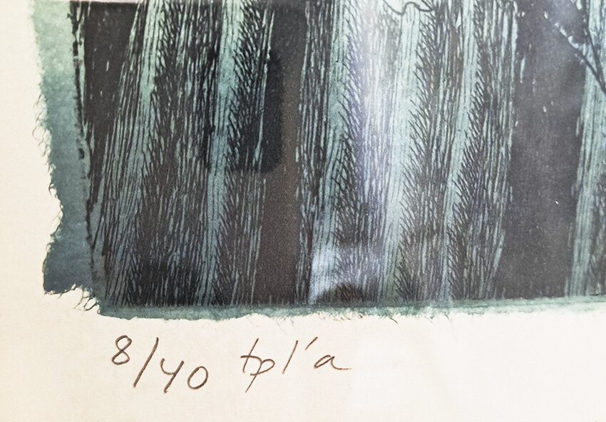
Traditional edition numbering for an etching; tpl’a or t.p.l’a. which comes from the French words “tiré par l’artiste”, printed by the artist. The photo is taken of the etching and chine collée work Yö (Night) by my mother Inari Krohn, etching artist and painter.
In traditional printmaking, e.g. etching, the process is (a bit simplified) as follows: a metal plate is covered with a compound that's resistant to acid. Then the image is drawn on the plate by scratching it with a needle pointed tool. Then the plate is put in the acid bath, and the acid makes the drawn lines visible by corrosing the metal. The acid resisting compound is then wiped off and the printing color is applied onto the plate. The excess of the printing color is wiped off and the plate is placed on a press and covered with a paper. When they are rolled through the press on top of each other, the color passes from the lines onto the paper resulting to a printed image.

On Pentti Sammallahti’s gelatin silver print (Signilskär, Finland. 1974) is marked only the artist’s signature and the year when the photograph is taken. The work is not placed in an edition.
However, as the weight of the press is so heavy, every time the metal plate goes through, it stretches a bit. After 50 prints, the plate has been stretched so that the thinnest lines get smudgy. That's why the etchings (and similar pressed artworks) were originally put in the editions. The editions were a way to ensure the quality of the prints. For the same reason, usually the first prints of the edition are more valuable than the last ones. You may see more information about etching from this Wikipedia article.
But in photography, there doesn't exist any such technical reason. The negative isn't affected in any way by the light that goes through it. The editions in photography art are in place for two reasons: for taxation, as in Finland the photographs are placed into editions to ensure a lower tax rate for them. The second reason are the curators, the managers and the contemporary art scene. Many galleries demand artists to place their photographs into editions so that they may sell them for higher price. People tend to see things more valuable fewer there are of them and as a result are willing to pay more money for the artworks.
However the edition isn't a part of the fine art photography tradition. Early photographers thought even that photography was supposed to be a democratic art form, available for the people who didn't have money to buy oil paintings.
As I work in the fine art printing tradition I don't place my photographs in the editions. I make each of them in the darkroom by hand, applying to them a long, pedantic and partly unique process. Even though with machine made photography the editions might be a way to ensure that there won't be hundreds of prints of the same photograph, in my case that never would be the case. I treat my photographs uniquely with reducers, toners and spot them by hand. The handmade nature of my prints is enough to give them a value, which I don't see necessary to raise by editions.
In Finland I share this thought with Kristoffer Albrecht, Natalia Kopkina and Pentti Sammallahti who don't use editions either. In Finland, in the photography field editions are used often by the artists who identify their work more within the contemporary art instead of the fine art photography tradition. I've noticed that in Finland the value of the artwork is more often determined by the name of the artist than by the edition.
5. The technical question: How to know what is a good print?

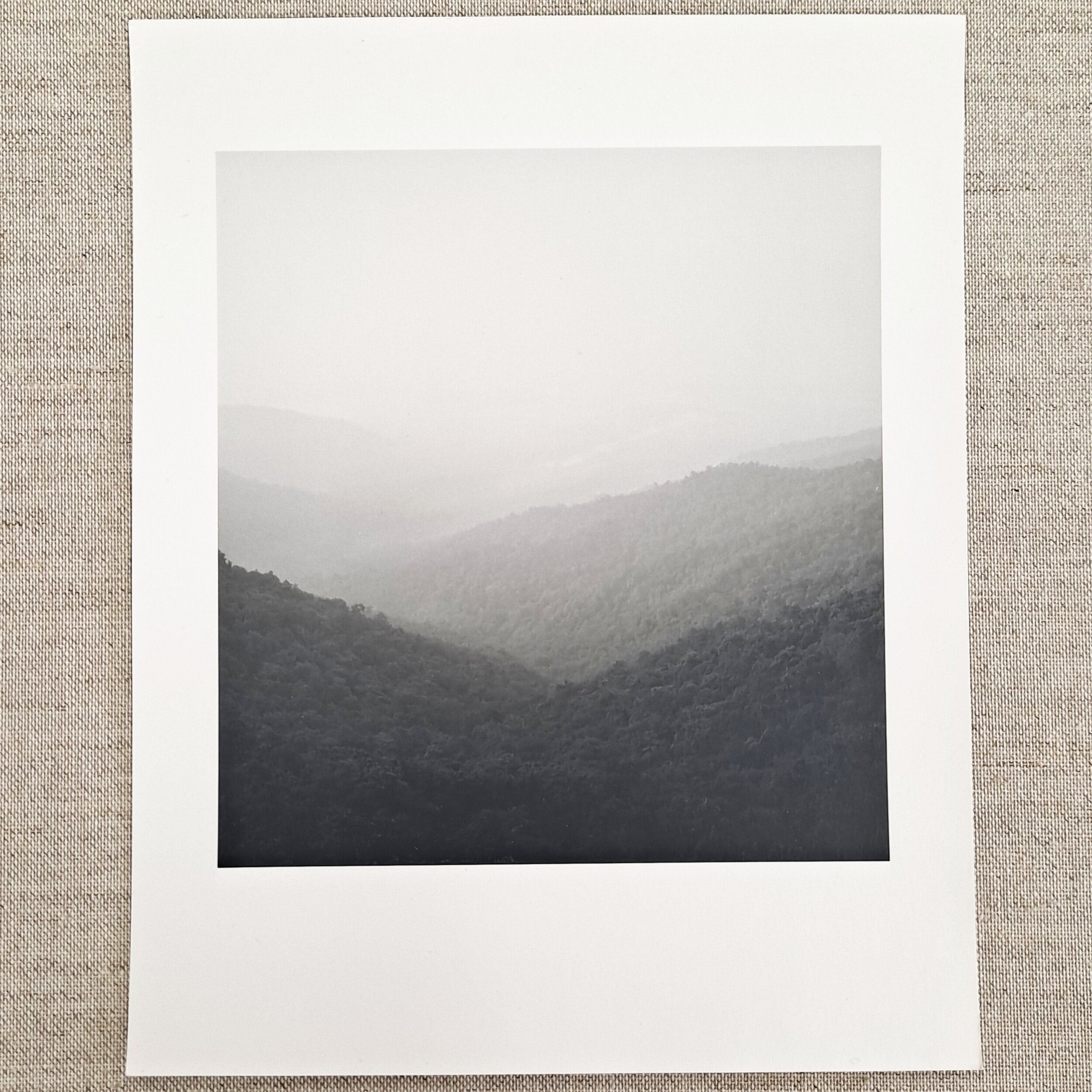
In this print (Kesäniemi II. Jämsä, Finland. 2017) the tones are not the best they could be. The dark end is pitch black and the light upper corner mixes with the paper white with no visible line. The print is slightly wrinkled as it hasn’t been heat pressed.
Between artists there are a lot of differences in what means a "good print". In the contemporary art field we've often heard the claim: "Even my kid could've done this!" This experience describes well the fact that the technical mastery is no longer an evident criteria for a work of art. However in the fine art gelatin silver printing tradition where I usually work myself, there are some straightforward criteria. They usually match with the trait of archival quality and for that are worth mentioning.
At first in a classic gelatin silver print you want to look at the paper used. The paper base, meaning the part of the paper which isn't the picture, should be of neutral white color. It the paper is extremely yellow or even spotty, it means that the photograph is poorly washed and the quality has suffered. That means that the print isn't going to endure time in the same way that a well washed print does.
Second; glance at the corners of the print. In the fine art printing tradition there are some markers on which you can judge if the artist really knows their stuff. One of the easiest things to check are the corners of the image in a landscape image or similar simple composition. In the tradition the aim is that the image is "in balance". When printing a gelatin silver print there are given extra exposures for the print (called burnings) to ensure that the upper corners of the print are the same tone. If one of them is really dark and one of them really light, the image composition seems to be tilting.
Third you may want to check the finishing of the print. During the exposure, the dust particles on the negative leave small white traces on the print. That is quite normal. However these spots are spotted away with a small brush and appropriate archival quality colors after the developing. If there are visible white spots and hair in the print, the artist has been sloppy. You may also want to check the surface of the print. It should be somewhat flat. During the drying especially the fiber-based prints get curvy and should be pressed afterwards. It's normal that especially in larger prints some curves exist, but the print shouldn't be wrinkled.
Fine art gelatin silver print is aims to be an artwork with well executed process and tonal control. In this print of mine (Hills of Dadeldhura, Nepal, 2013) the aim was to achieve a wide range of grey tones while keeping the sky light and airy. Notice the corners, which are of the same grey tone, and needed for that several extra exposures during the developing process.
The most difficult trait: the quality of the tones
The biggest challenge is to describe the quality of the black and white tonal range and its control. A professional gelatin silver print artist is able to make a print which articulates their artistic intention and the result isn't accidental. The artist has a certain idea which they are able to convey in a print. As the artists have different tastes the results also differ considerably from each other. One artist may prefer their prints grainy and contrasty, the other smooth surfaced and delicate.
In the fine art gelatin silver printing tradition the aim usually is that in a successful print may be found both the rich tonal range and good contrasts. That is also the challenge in printing, and thus often valued in the field. When looking at a print you may for instance check that in the both, dark and light areas there are left some details. The dark end isn't pitch black and the light end hasn't gone all white.
On the other hand, this ideal of a rich tonal range hasn't always been important. For instance in the 1960's and 70’s in Finland the photographs were so contrasty that they had hardly any grey tones between white and black. Also within fine art printing tradition even the same artist's prints may vary. Some print the artist may want to be dramatic and dark, and another airy and delicate.
There are also differences between negatives. As some negatives are easier to print than others, also the resulting prints end up being different. Experienced artist knows their limits and leaves too challenging negatives to wait for the future days.
To get the idea of the artist's strengths and the quality of their prints I recommend to get to know their body of work and their career instead of a single print. It opens up the understanding of the artist's personal style and the possibilities and restrictions of the gelatin silver technique in general. After knowing more about the possibilities of the technique it's easier to judge if the print is successful in its tones or not.
To Conclude
The art of gelatin silver printing photography together with other forms of darkroom photographic arts have become increasingly rare after the beginning of 2000's. Even though there's now going on a delightful worldwide analogue boom, the amount of artists working in the field has decreased considerably. Most of the photography art prints today are made by printing machines, not by hand in a darkroom.
The chain of darkroom art tradition was close of disappearing in the 2010's In Finland completely. We were six female darkroom photography artists who founded in 2016 the Finnish Darkroom Association, with the aim of conserving the knowledge of this unique field for the future generations.
The association now gathers the knowledge from the leading darkroom masters in Finland and abroad to preserve this know-how. The conserving isn't enough though, because as any craft, also the craft of darkroom printing degenerates when not trained. There are only a handful of darkroom artists in Finland like myself, who've been training the craft continuously since the end of 1990's.
Our association offers many darkroom art courses annually, but the decline in the darkroom education at the university level is still something to worry about. There's only one gelatin silver printing course offered at the Aalto University Department of Photography on MA level at the moment.
The gelatin silver printing tradition which I represent is a fascinating art form which creates a concrete link between the present and the past of photography’s history. Apart from that, in gelatin silver prints there exist a unique shine, resulting from the real silver grains and impossible to achieve in any other methods.